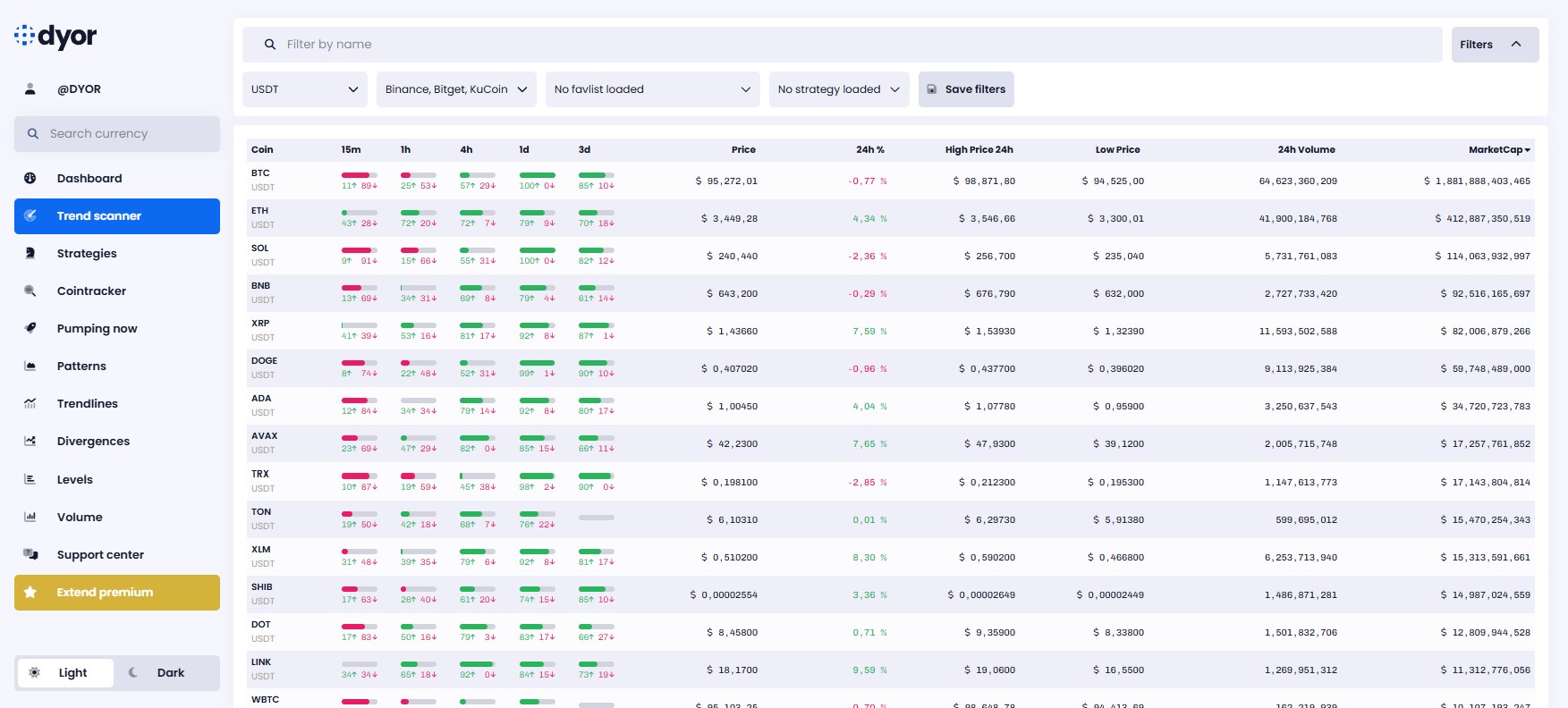
I am often asked how to read the trendscanner on DYOR.net. And I understand that without an explanation, it might not be entirely intuitive. You’ll see, though, that it’s actually quite simple—once it’s explained.
Cryptocurrencies are scanned across different timeframes: 15m, 1h, 4h, 1d, and 3d (when available). Each timeframe is analyzed to determine the trend. Scans are performed at the close of each new candle—every fifteen minutes for the 15m timeframe, every hour for the 1h timeframe, and so on.
Each timeframe has an independent trend: for example, the trend might be bearish on the 15m timeframe but bullish on the 1d timeframe. This could suggest the beginning of a trend reversal.
Now, let’s get to the main point: how do you interpret these results?
Each result includes three elements: a gauge, followed by two numbers—a green one with an upward arrow, and a red one with a downward arrow.
What do these numbers mean?
The green number indicates the strength of the bullish trend, while the red number indicates the strength of the bearish trend. These numbers are calibrated on an absolute scale from 0 to 100. The closer a number is to zero, the weaker the trend strength. Conversely, the closer it is to 100, the stronger the trend.
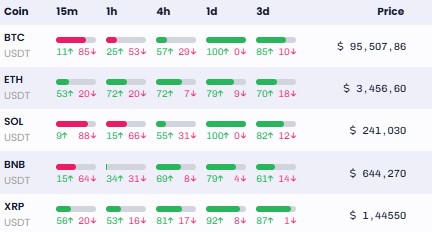
The gauge simply reflects these two values. Let’s take an example with Bitcoin from the screenshot below:

On the 15m timeframe, the bullish trend strength is 11, and the bearish trend strength is 85. So, we simply calculate the difference between the two values: 85 – 11 = 74. The gauge will be filled in red to indicate a bearish trend at 74%.
On the 4h timeframe, the bullish trend strength is 57, and the bearish trend strength is 29. The difference is: 57 – 29 = 28. The gauge is filled at 28%. Since the trend is more bullish, it is filled in green.
If the gauge is highly filled, it means the difference between the bullish and bearish trend strengths is significant, indicating a strong trend either upward or downward, depending on the gauge’s color. On the other hand, if it is not very filled, it means the token does not exhibit a particular trend, or at least not one strong enough to be worth considering (on its trend alone, at least).
How are these trends calculated?
Trends are calculated by aggregating numerous trading indicators, such as moving averages, the supertrend, ADX, and MACD. Various parameters are taken into account to define a reliable trend. Ultimately, the DYOR.net trendscanner aims to be an aggregator of all these indicators, providing you with a quick view of the trends for each cryptocurrency. It’s a huge time-saver to help you identify the best setups!
I hope these explanations help you make the most of this incredible feature, the trendscanner! Feel free to ask any questions via DYOR.net’s support, email, or Twitter/X (@DyorNetCrypto).

